Status Pages
A status page is the public face of your service health, a separate surface from the internal alert console where customers, partners, and stakeholders can see what’s working, what isn’t, and what you’re doing about it. This page explains the mental model end-to-end: what gets published, what stays internal, how visitors experience it, and the editorial control you keep.
The mental model
Section titled “The mental model”YipYap separates the internal alert stream from the public health surface on purpose. Two distinct planes:
- Alerts are the firehose: every monitor state change, every flap, every escalation, every notification. Operators care about all of this. Customers don’t.
- Status pages are the curated surface: a hand-picked set of monitors organised by what users actually care about, plus operator-authored incidents that explain disruptions in customer-facing language.
Nothing on the public status page is automatic except the monitor up/down badges. Incidents are publishable on demand, you decide when something is worth telling visitors about, what to call it, and when it’s resolved. A monitor flapping for ten seconds doesn’t need to become a public incident; a deploy that broke checkout for half an hour does.
What a visitor sees
Section titled “What a visitor sees”Open https://console.yipyap.run/<your-org>/status/<page-slug> (no login required) and the page renders a single HTML document:
- Overall status banner at the top. Three colours: green (“All Systems Operational”), amber (“Partial / Minor / Degraded”), red (“Major System Outage”). The banner reflects the worst of:
- The active set of in-flight incidents (severity-weighted), AND
- The current state of the monitors on the page.
- Active incident timeline. Every unresolved incident linked to this page renders here, newest update first. Each shows title, severity, affected monitors (by name), and the running thread of operator-authored updates.
- Component groups. Your organisational sections, “API”, “Web App”, “Database”, each with the monitors you placed inside them. Per-monitor display is configurable: status badge, uptime bar, latency sparkline, recent check history, recent incidents inline.
- Recent resolved incidents. The trailing seven days of resolved incidents, collapsed by default, expandable.
- Custom CSS (if configured) restyles the rendered page. Sanitised server-side, no scripts, no external imports, no
\escape sequences.
The page is server-rendered HTML, fast on slow networks, and works without JavaScript for the vast majority of the layout. (Sparkline charts use a small client-side script when present.)
What’s NOT on the page
Section titled “What’s NOT on the page”To set expectations correctly:
- No subscribers. YipYap doesn’t currently send email/SMS/RSS updates to status-page visitors. Visitors who want updates check the page or watch their RSS reader against the page URL, there’s no opt-in subscription form. (If your stakeholders need push, route a copy of the incident-update events to a dedicated notification channel like Slack or webhook.)
- No custom domains. Status pages live at
console.yipyap.run/<org>/status/<slug>. There’s no CNAME orstatus.example.commapping today. - No service-catalog components. Status pages display monitors. The service catalog is a separate internal-facing surface; services don’t render on public pages.
- No private/auth-gated status pages. Every page is fully public to anyone with the URL. If a page is sensitive, don’t link to it externally, but understand the URL is enumerable if attackers know your org slug.
- No free-form text components. Each item on the page is a monitor; descriptive text lives in the page-level description and per-monitor display name.
If any of these are blockers for your use case, raise it in the console feedback form, they’re tracked as feature requests.
The data flow
Section titled “The data flow”The page assembles itself on every request. When a visitor opens /{org}/status/{slug}, the server-rendered handler looks up the page record, fetches its groups and the monitors inside each group, joins each monitor’s current state, pulls in the active and recently-resolved incidents linked to this page, computes the overall-status banner from the worst monitor state and incident severity, and renders a single HTML response with sanitised custom CSS injected at the top.
The monitor side updates continuously without operator action. The incident side is fully operator-driven: you create, update, and resolve incidents through the console (or the API), and you control which page each incident appears on via the link table.
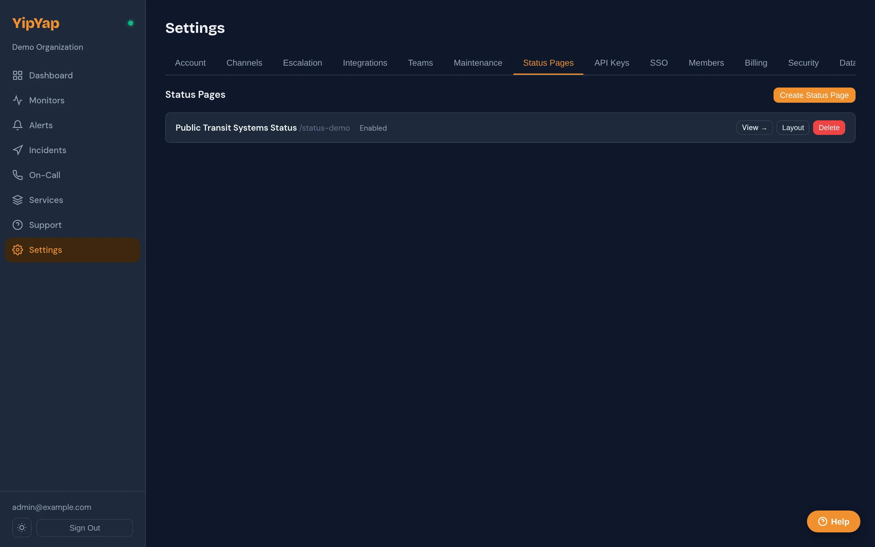
Setting up a status page
Section titled “Setting up a status page”- Settings → Status Pages → New Status Page.
- Name is the human-readable title that renders in the visitor’s tab and at the top of the page.
- Slug becomes the URL segment. Lowercase, alphanumeric, hyphens. Immutable once visitors have the link, pick something durable.
- Description renders under the title. Markdown is NOT supported; treat it as plain text.
- Custom CSS (optional) ships verbatim to the visitor’s browser, sanitised. See Custom CSS below for what’s allowed.
- Enabled toggle. When unchecked, visitors hitting the URL get a 404, useful to stage a page before announcing it.
- Save.
The page is now live but empty. Add groups + monitors next.
Groups and monitors
Section titled “Groups and monitors”Status pages are organised into groups, labelled sections that contain monitors. A page with three groups (“API”, “Web App”, “Database”) displays as three sections. Reorder groups and the monitors inside them with the up and down arrow buttons in the layout editor.
Each group has:
- Name, the section heading visitors see.
- Default expanded, whether the section is open or collapsed on first visit. Useful when a group is rarely-relevant (e.g., legacy services kept for transparency).
- Position, order on the page, top to bottom.
Each monitor on the page is added with display options:
| Option | Default | Meaning |
|---|---|---|
display_name | empty | Override the monitor’s internal name. Use this to make “checkout-prod-us-east-1” render as “Checkout API” to visitors. |
show_status | true | Render the green/amber/red badge. |
show_uptime_bar | true | Render the rolling uptime bar (the column of green segments). |
uptime_periods | ”30d” | What window the uptime bar covers. Common values: 7d, 30d, 90d. |
show_latency | false | Render a tiny latency sparkline alongside status. Off by default, most users find it noisy on a status page. |
show_checks | false | Render the most recent N check results inline. Mostly for debug pages. |
show_incidents | true | Show this monitor’s recent incidents inline beneath its row. |
Drag monitors between groups to re-organise. Monitors not assigned to any group render in an “Other” section above the named groups.
Status mapping
Section titled “Status mapping”The badge a visitor sees on each monitor depends on the monitor’s current state. The mapping:
| Monitor state | Public badge |
|---|---|
| Up | ”Operational” (green) |
| Degraded | ”Degraded Performance” (amber) |
| Down | ”Outage” (red) |
| Paused | ”Paused” (grey), monitor is intentionally off |
| Muted | Treated as Up, muting hides alerts internally but the public sees normal status |
| Maintenance | ”Maintenance” (blue badge with the window’s description) |
| Custom states | Mapped per state’s severity field, see Custom States |
Maintenance is the one transition operators frequently miss: when a maintenance window covering a monitor is active, the public page shows a “Maintenance” badge (not red), and the page-level overall banner is unaffected. Without this mapping, planned deploys would publish as “Outage” on the public page, confusing and embarrassing.
Incidents
Section titled “Incidents”Status pages display incidents, operator-authored, customer-facing records of disruptions. Distinct from alerts:
- Alerts are internal pages/notifications driven by monitor state.
- Incidents are public communications driven by operators.
You create an incident, link it to one or more status pages, mark which monitors it affects, and post updates. Visitors see the incident on every linked page until you mark it resolved.
Promoting an alert to an incident
Section titled “Promoting an alert to an incident”The most common flow:
- An alert fires, your on-call gets paged, they investigate.
- The on-call decides this is customer-impacting and clicks Create incident on the alert detail page.
- YipYap pre-populates the incident with: title (from the alert summary), severity (mapped from alert severity), the affected monitor (linked).
- The on-call picks which status pages to link the incident to, types a customer-facing first update, and publishes.
- As the incident progresses, the on-call posts further updates (
investigating→identified→monitoring→resolved). Each update shows on the public timeline; updates withpublic: falsestay internal.
The whole flow is also available via the Incidents API, bridges to PagerDuty / Opsgenie / your own runbook tooling can use it directly.
Severity → banner mapping
Section titled “Severity → banner mapping”When at least one active incident is linked to the page, the page-level banner reflects the worst severity:
| Worst active severity | Banner |
|---|---|
| Critical | ”Major System Outage” (red) |
| Major | ”Partial System Disruption” (amber) |
| Minor | ”Minor Service Degradation” (amber) |
When no incidents are active, the banner is computed from monitors only (any down → red; any degraded → amber; otherwise green).
Public vs internal updates
Section titled “Public vs internal updates”Each incident update has a public flag. Updates marked public appear on the status page; updates marked private stay in the console for the operator team. Use private updates for internal coordination (“rolling back via runbook X, ETA 5min”) and public updates for customer-facing communication (“we’ve identified the cause and are rolling back the deployment”).
Custom CSS
Section titled “Custom CSS”Each status page accepts a block of CSS in the custom_css field. It is injected verbatim into the page’s <style> block on every render, after the default theme, so anything you write overrides the defaults via normal CSS cascade rules.
What gets sanitised
Section titled “What gets sanitised”The render path runs a small allowlist sanitiser before the CSS reaches the visitor’s browser:
| Construct | What happens |
|---|---|
Backslash escape sequences (\) | The entire custom CSS block is rejected and the page renders with the default theme only. Avoid Unicode escapes (\\E901), CSS character escapes (\\"), and any other \ use. |
@import url(...) | The whole @import line is stripped. |
url(...) calls | The token url( is rewritten to blocked(, breaking any rule that relied on it. This means external images, @font-face src: url(...), gradient image data URIs, and SVG masks all stop working. |
expression(...) | Rewritten to blocked(. Legacy IE-only construct; nothing of yours should rely on it. |
javascript: URI prefix | Rewritten to blocked:. |
What this means in practice: you can change colours, sizes, spacing, fonts (using fonts that are already on the visitor’s system or that the page already loads), borders, shadows, animations, and pseudo-elements. You cannot load images, custom fonts, or any external resource.
Theme variables you can override
Section titled “Theme variables you can override”The default theme exposes its colour palette as CSS custom properties on :root. The cleanest way to brand your status page is to set these once at the top of your custom CSS:
:root {  --sp-bg: #fef3e2;             /* page background */  --sp-surface: #ffffff;         /* card/component background */  --sp-text: #3d2810;            /* primary text */  --sp-text-secondary: #6b5343;  /* meta text under titles */  --sp-text-muted: #94816d;      /* timestamps, separators */  --sp-border: #ead7c1;          /* card borders */
  --sp-up: #10b981;              /* operational green */  --sp-up-light: #d1fae5;        /* up-banner background */  --sp-down: #ef4444;            /* outage red */  --sp-down-light: #fee2e2;      /* down-banner background */  --sp-degraded: #f59e0b;        /* degraded amber */  --sp-degraded-light: #fef3c7;  /* degraded-banner background */  --sp-unknown: #94a3b8;         /* unknown grey */
  --sp-accent: #F19030;          /* accent colour (footer link, brand chrome) */  --sp-radius: 12px;             /* card corner radius */  --sp-radius-sm: 8px;           /* small element corner radius */}
The default theme also has a built-in dark mode that activates on prefers-color-scheme: dark. To customise dark mode, target the same variables inside that media query:
@media (prefers-color-scheme: dark) { :root { --sp-bg: #1a0f06; --sp-surface: #2a1f15; --sp-text: #fef3e2; --sp-border: #4a3826; }}Selector reference
Section titled “Selector reference”Beyond the variables, the page uses a stable sp-* class hierarchy you can target directly:
| Selector | What it is |
|---|---|
.sp-container | The outer wrapper. Default max-width: 800px, centred. Override here to widen or narrow the page. |
.sp-header, .sp-header h1, .sp-header-desc | Page title + description region at the top. |
.sp-banner | The big overall-status banner. Variants: .sp-banner-up, .sp-banner-degraded, .sp-banner-down, .sp-banner-unknown. |
.sp-section | A group section (e.g. “API”, “Web App”). |
.sp-section-title | The group heading text. |
.sp-component | One monitor row inside a group. |
.sp-component-header, .sp-component-name, .sp-component-status | The row’s flex layout: name on the left, status on the right. |
.sp-dot | The status pill before each monitor’s status text. Variants: .sp-dot-up, .sp-dot-down, .sp-dot-degraded, .sp-dot-unknown. |
.sp-uptime-info | The “Uptime: 99.97% (last 30d)” line under each monitor. |
.sp-latency-info | The latency sparkline data, when show_latency is enabled. |
.sp-incidents-section, .sp-incidents-title | Past-incidents container. |
.sp-incident, .sp-incident-header, .sp-incident-name, .sp-incident-date, .sp-incident-status | Individual incident cards in the active and past sections. Severity variants: .sp-incident-critical, .sp-incident-warning. |
.sp-footer, .sp-footer a | The legal footer at the bottom. The text content is fixed for compliance, but you can restyle it. |
Worked examples
Section titled “Worked examples”Brand-coloured page using your existing palette. Drops in a warm light theme with your accent colour as the link/badge highlight.
:root { --sp-bg: #fef3e2; --sp-surface: #ffffff; --sp-text: #3d2810; --sp-accent: #F19030; --sp-border: #ead7c1;}.sp-header h1 { font-weight: 600; letter-spacing: -0.01em;}.sp-banner { border-radius: 16px; font-weight: 600;}Tighten the layout for an executive dashboard view. Wider container, smaller monitor rows.
.sp-container { max-width: 1100px; padding: 1rem 2rem;}.sp-component { padding: 0.5rem 0.875rem;}.sp-component-name { font-size: 0.875rem;}Use a system font that is already universally available. No external font-loading; just CSS variable swap.
body { font-family: -apple-system, BlinkMacSystemFont, "Segoe UI", system-ui, sans-serif;}.sp-section-title { text-transform: uppercase; letter-spacing: 0.06em; font-size: 0.75rem;}Borrow the system status colour from operational, not red, for “Outage”. Useful for an internal-only page where you do not want red flagging anything. (Niche; included to show variant overrides.)
.sp-banner-down { background: var(--sp-degraded-light); color: var(--sp-degraded);}.sp-dot-down { background: var(--sp-degraded);}Limits, in case you bump into them
Section titled “Limits, in case you bump into them”- No external resources. No web fonts hosted on Google Fonts, no images on a CDN, no SVG sprites loaded over
url(). The sanitiser breaks everyurl(...)reference. - No script. It is a CSS-only field.
- No structural changes. You cannot add nodes to the DOM, only restyle existing ones. If a structural change matters to your team, raise it in the console feedback form so we can scope it as a feature rather than a workaround.
- No overriding the legal footer. You can restyle it, but we keep its text content for compliance; rules that try to
display: noneorcontent: ''it are honoured by the browser, but doing so puts your deployment outside the licence terms.
How to test your CSS safely
Section titled “How to test your CSS safely”The Custom CSS field in the page editor is a plain textarea, no syntax highlighting, no preview. To iterate, you save and reload the rendered public URL.
Because every status page is public to anyone who knows its URL, the safe pattern is to keep a staging page on an unguessable slug while you iterate, then copy the working CSS to your production page once it looks right:
- Create a second status page in the same org with a slug like
staging-7c4f(something not enumerable). Set Enabled to true and recreate the same group and monitor layout. - Paste your CSS into the staging page’s Custom CSS field and save. The rendered output is live at
/{org-slug}/status/staging-7c4f. Refresh the page after each save to see your edits. - Toggle your browser between light and dark colour schemes (in Chromium DevTools, Rendering → Emulate CSS media feature
prefers-color-scheme) to confirm both modes look right. - Once you are happy, copy the CSS into your production page’s Custom CSS field and save.
- Either delete the staging page or set Enabled to false; the staging URL then returns 404.
Multiple pages per org
Section titled “Multiple pages per org”A single org can run multiple status pages. Common patterns:
- Per audience. A “public.example.com” page for end-users, a “partners.example.com” page for B2B integrations with more detail.
- Per region. “EU status”, “US status”, link the relevant regional monitors only.
- Per product line. “Checkout status”, “Reporting status”, different audiences, different monitor sets.
Each page is independently configured (slug, layout, custom CSS, enabled flag). An incident can be linked to any subset of pages, you publish customer-facing communication on the relevant audiences only.
Maintenance windows
Section titled “Maintenance windows”Maintenance windows (feature page) automatically suppress alert pages and render a “Maintenance” badge on the public status page. No incident creation needed, operators schedule the window in advance, the badge appears on the start time and clears on the end time. Banner-level and per-monitor display both honour the window.
Operational tips
Section titled “Operational tips”- Test the slug before publishing. Create the page with
enabled: false, share the URL with a teammate, then flip the flag once you’re satisfied with the layout. - Keep groups stable. Renaming a group is fine; deleting one and recreating it under a different name breaks visitor muscle memory and any external links pointing at section anchors.
- Don’t put internal infrastructure on a public page. Database servers, message queues, Kubernetes nodes, these add noise without value to customers. The right audience for those is your on-call team via alerts, not a public page.
- Resolve incidents promptly. A status page with a four-hour-old “still investigating” update reads worse than one with a clean resolution and a postmortem link.
- Use display_name aggressively. Monitor IDs that make sense internally (e.g.,
checkout-prod-us-east-1) confuse customers. The display_name override lets you ship a clean public face without renaming the underlying monitor.
Related reference
Section titled “Related reference”- Status Pages API, programmatic management.
- Incidents API, incident lifecycle, updates, status-page linking.
- Maintenance Windows, scheduled downtime that doesn’t trigger public outage badges.
- Custom Monitor States, how non-standard states map to public badges.